7X7 Magazine thinks creatively about vintage letters

 There was a sense of sweet delight when the November issue of 7x7, San Francisco's premier city magazine, hit the newsstands.
 The headline for The Artist's Way was composed of images of a variety of our vintage letters salvaged from movie theater marquees, old store signs and defunct gas stations.
The clever use of "art" to illustrate art was conceived by the magazine's design trio of Ben Hardiman, Leilani Labong and Stefanie Michejda.
There's a short story-behind-the-story. Leilani, 7X7's research editor and producer of the photo feature, contacted us in late summer about including a random grouping of vintage letters in an upcoming article. She planned to focus on design ideas to spark your creative juices, even if you believe you "can't draw a stick figure to save your life."
Design director Ben expanded on the concept and proposed using the letters to create the illustrated headline. It was then up to photo editor Stefanie to shoot more than 40 separate images in different typefaces, sizes, colors and materials from which Ben chose the final 14.
The result is eye-catching and colorful, and gives readers another take on green design. To Ben, Stefanie and Leilani we say "thanks for including us!" and, we can't resist, "way to go!"
At Timeless Treasures, we often say that the great appeal of using vintage sign letters to create a personal statement lies in the limitless creativity that can come from tossing aside all the old rules.
Never could mark a straight line without a ruler, you say? Stumped at choosing the "right" color for the walls in your home? Or, as Leilani points out, "Can't draw a stick figure to save your life?" It doesn't matter! You can create a marvelous, personal work of art simply by choosing and arranging vintage letters that strike your fancy. It doesn't require dexterity, or even a particular color sense. And, unlike 6th grade art class, there are no wrong solutions when it comes to composing art for yourself.
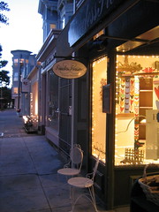
So come and see us on Sutter Street. Experiment with a word or phrase that appeals to you! We have lots of words and phrases on the walls to inspire you.
posted by Timeless Treasures, San Francisco @ 9:51 AM
![]()
![]()